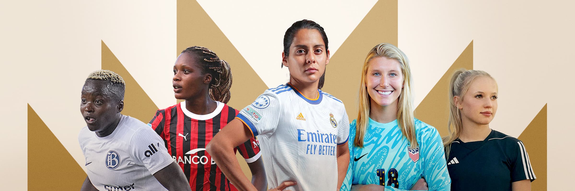
The Royal Treatment Women Deserve.
TMJ is the professional athlete management firm that’s done more than any other company to fight for a more rewarding, equitable future for female football players. When TMJ came to BlackWing with a hard-won record of success, a huge social media following, and a blank canvas for a new brand, we answered the call.
Jonathan’s Posts
01.15.2025 The Royal Treatment Women Deserve.
03.25.2024 Ineffective Advertising is a Climate Crime.
02.08.2024 BlackWing Will Weigh in on the World’s Best Creative Work.
Where Women’s Football Rules.
Starting from a logo and a compelling company history, BlackWing developed a fully realized brand for TMJ. It started with a powerhouse marketplace position. That led to an inspiring brand story. We then created a complete visual platform and brand guide. And, our work culminated in a visually stunning website that BlackWing designed, wrote, and built from the ground up.
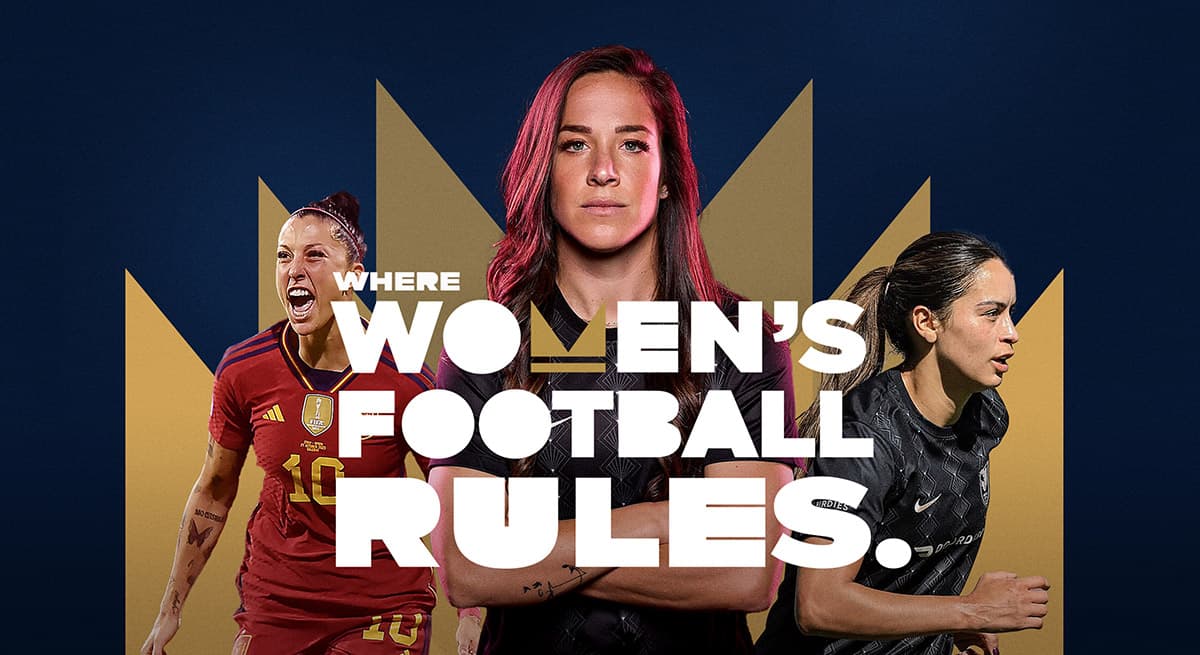
Strategically On Mark.
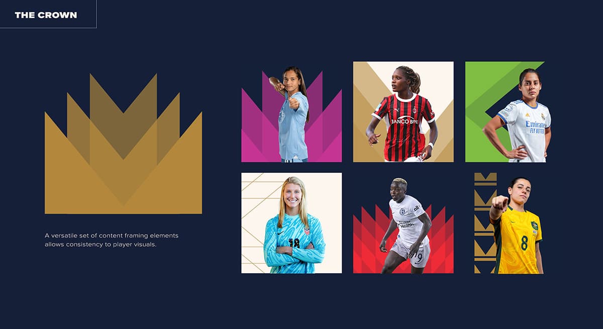
The one thing TMJ came to us with was their logo, which contains a stylized M. In the process of crafting the TMJ brand story and learning about the immense sacrifice that TMJ leaders have made to elevate female athletes and the women’s game, we transformed this M shape into a crown graphic that serves as a foundational element of all TMJ brand expressions. And from there, the brand tagline was born, “Where Women’s Football Rules.”
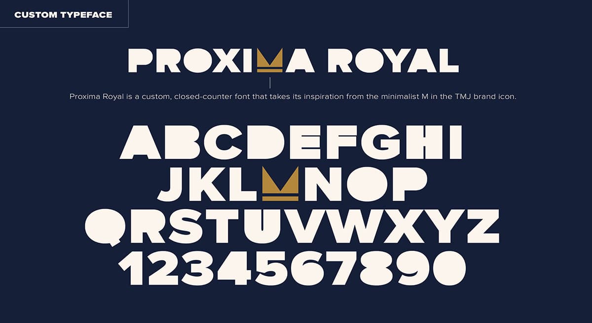
Custom Type That Packs A Punch.
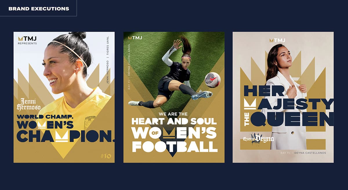
We modified an off-the-shelf typeface to create Proxima Royal — a custom, closed-counter font that takes its inspiration from the minimalist M in the TMJ brand icon. This gave us the in-your-face, visual stopping power we needed to create headlines that are pieces of art, and feature the brand identity mark when possible. The type reflects our boldness, passion and dedication to never backing down for what’s right.
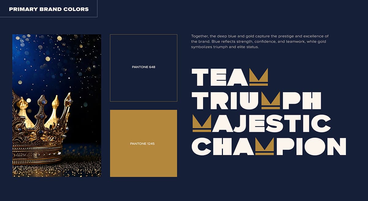
A Visually Rich And Versatile Design System.
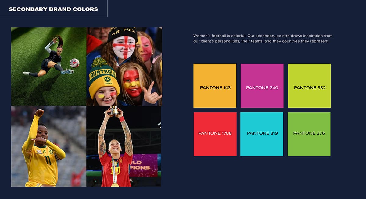
To amplify TMJ’s message of royal treatment and elite status, we built a color palette on a base of deep blue and luxurious gold. We then layered in a bright and intense secondary color palette that draws from player personalities and the countries they represent.
To solve the challenge of working with images that are wildly different in quality and style, we created a versatile set of content framing elements based on the crown shape. This allowed us to remove backgrounds from player photos and add consistency to visual treatments.
Considerations For TMJ Sub-Brands.
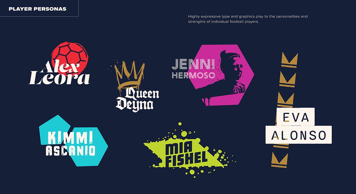
One unique challenge we faced was giving the marketing and endorsement arm of TMJ its own brand tools. We achieved this through highly expressive type and graphics that could play to the personalities and strengths of individual football players.
A Site That Exudes Passion And Professionalism.
At TMJ, the focus is on the players and serving them like no other. We brought this to life on the website we created and launched. Using modern WordPress best practices, we built a web presence that is visually appealing, mobile-first, and future-ready.
The site leverages the star power of leading athletes with in-depth video stories. And it’s constantly updated with live content from TMJ’s 40,000-follower Instagram feed.


